
Welcome to issue #9 of Content, Curated.
I wanted to kick things off discussing a topic I’ve been tweeting about sporadically over the last few months: diminishing returns.
1: a rate of yield that beyond a certain point fails to increase in proportion to additional investments of labour or capital
https://www.merriam-webster.com/dictionary/diminishing%20returns
2: benefits that beyond a certain point fail to increase in proportion to extended efforts
This may not be the best term to describe this, but in the context of content marketing, I’m talking specifically about content types/formats and how, eventually, they become less and less effective the more people (us) are churning them out.
Infographics are an easy example, and while they did work pretty effectively for a number of years, eventually people were sick of seeing them land in their inbox.
We often see trends appear throughout content marketing, for example if a particular idea does well (e.g. ‘dream job’ PR stunts, 1, 2, 3, 4, etc.), people try and replicate it. There’s nothing wrong with this, and it’s obviously not something that’s limited to just our industry, but it’s something that you should be aware of if you are creating content.
Journalists get bored of seeing the same/similar content dropping into their inboxes, and while there’s an argument around ‘if they’re still posting about dream jobs (for example), they must still be working’, it depends on what results you’re happy with and the expectations of your client. The first dream job examples got a boat load of coverage, but the numbers do begin to tail off with each additional piece. Try not to let the success of earlier examples cloud your judgement.
A recent Twitter thread called upon Digital PR’s to reveal trends they’re sick of, and it’s always interesting to hear what is and isn’t working well for others. Dream jobs, bar chart races and indexes were all mentioned (I’m a sucker for a good index, they do still work well though!), and if digital PRs are getting sick of these, imagine how journalists feel when they’re getting pitches for them every single day.
As content marketers, I think it’s important to recognise when a particular idea or format is experiencing fatigue, and to only pursue it if you think you can do a better job of it. If you can’t, then it may be a good idea to go back the drawing board and come up with a something more unique.
I’d be interested to hear other people’s thoughts on this, let me know on Twitter!
Now, on to the content…
Made something you’re proud of? I’d love to see it! Send it over to markprtr@gmail.com 💌
Must-see Content 👀
Every Pixel is One Animal🐅
Opening with a heavy hitter. Inspired by an 2008 WWF Japan campaign, JJSmooth44 put together a larger gallery of images containing blurry images of endangered animals. The images are composed of pixels, with each pixel representing how many of each species are alive today. It’s simple but sobering, and has been doing the rounds recently since going viral on Reddit.
Discovered via Catriona McGale 🕵️
The Contents of a Fire Truck 🚒

The above is just a snippet of a full graphic illustrating the contents of a firetruck. If you like this sort of thing, check out the ‘Things Organized Neatly‘ tumblr, which is full of satisfying compositions.
Discovered via Jaz Batisti 🕵️
Ye Olde Mad-Lib Pub Crawl Generator 🍺
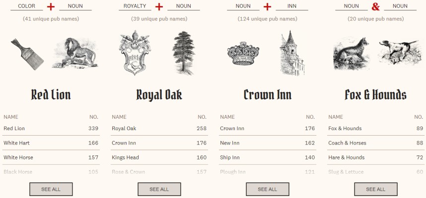
The Pudding have once again created a masterpiece, this time in the form of a mammoth pub crawl consisting of pubs with the same name. They whittled down 41,000 pubs using common naming patterns, before plotting the shortest route between each one with the same name, e.g. Red Lion, Crown Inn etc. Genius.
Insta Wealth 📸
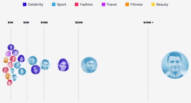
Fun fact: Based on my Instagram follower count, I would make $2.00 per sponsored post. Cristiano Ronaldo on the other hand, would make $975,000 per post, which is why he dominates this list of Instagram earners. Maybe it’s because he doesn’t know when to turn them down.
The Size of Space 🌌
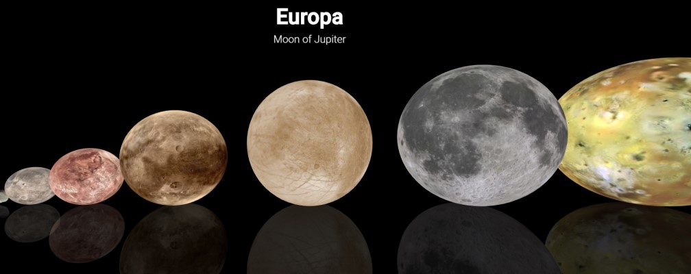
I’ll never get tired of mind-blowing space visualisations, and this one by Neil Agarwal is no exception. Use the arrow keys to scroll through, with each example making you feel slightly more insignificant each time. I also recommend you check out Neil’s homepage as he’s made a tonne of cool things.
Overview 🛰️
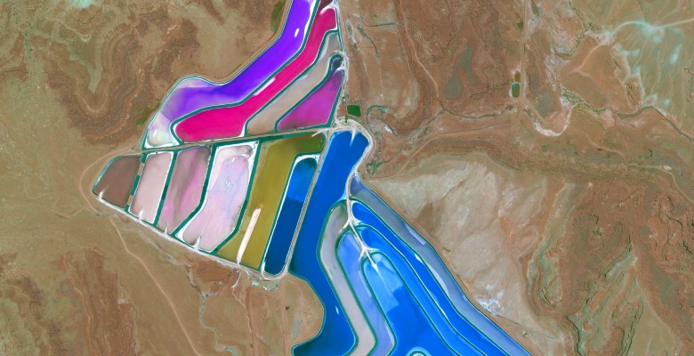
Overview is a collection of satellite imagery of our planet, allowing you to browse through categories consisting of cities, mining sites, transport networks and more. It’s pretty awe-inspiring stuff.
The Car Size Evolution 🚗
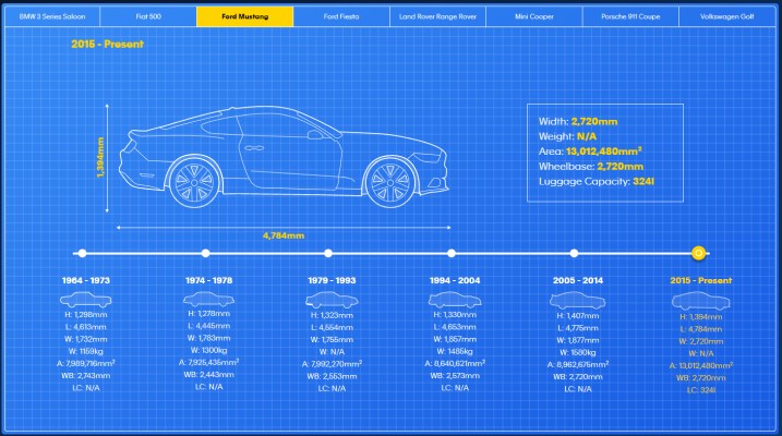
Are cars getting bigger? Or are parking spaces getting smaller? This piece from Zuto looks at the evolution of 8 different car models to find out if they’ve grown, stayed the same or decreased.
Discovered via Oliver Brett 🕵️
Fashion in 27 Countries 💄

This recent piece by Groom+Style looks at how 27 countries define style. It appears to be inspired by this classic ‘Perceptions of Perfection‘ piece by the folks at Frac.tl, asking fashion photographers, designers and photoshop experts to create their idea of the perfect man and woman. Historically these pieces have worked well, but the massive caveat is that you’re basing an entire country’s opinion on just one person’s thoughts.
Discovered via Laura Brady 🕵️
Responsible Travel Map 🌲
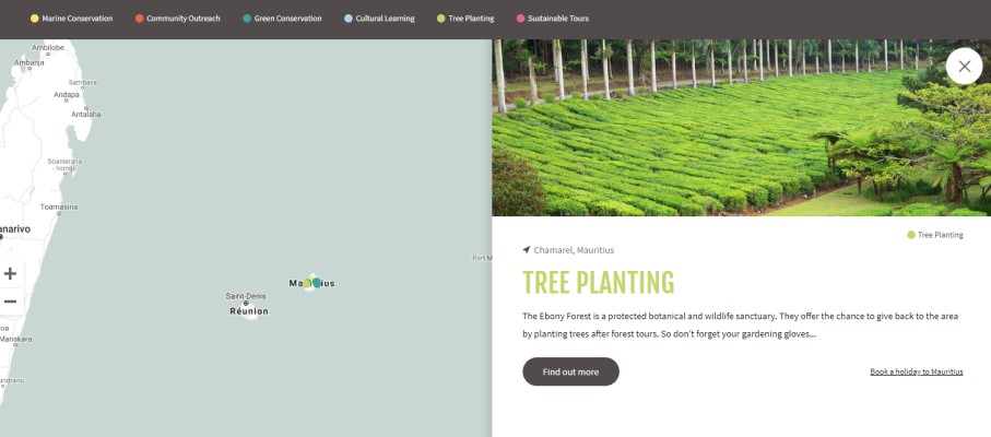
If your conscious of the environmental impact of your travels, this map shows you different ways to give back to the country your visiting, such as marine conservation, community outreach, tree planting and more.
Discovered via Rob Shaw 🕵️
Pioneering Women 👩
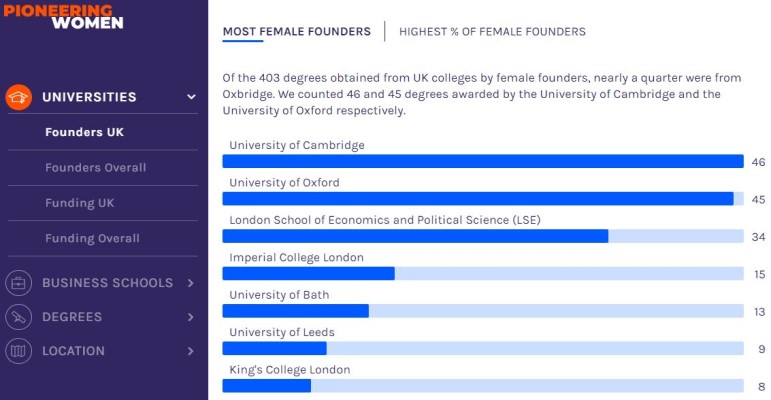
This data-driven piece looks at female founders, including where they obtained their degree, what locations dished out the most funding to female-founded companies and more. The piece does a really good job of clearly presenting the various hooks to the piece.
More Great Content…
- Most Googled Household Questions 🖥️
- Wildlife Index 2019 🦍
- The UK Cities Where Rent Is Rising the Fastest 🏠
- Indices of Multiple Deprivation 2019 🏠
- Most Popular Candy in Every Us State Based on Google 🍬
- The Real Size of Our Solar System ☄️
PR Stunts
The below campaigns may not have been intentional PR stunts, however they did attract substantial attention from the media.
The Book of Dreams 💤
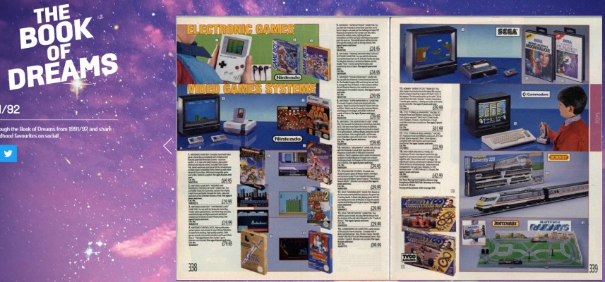
Warning: Nostalgia overload. This is very UK specific, but going through the Argos catalogue as a kid and circling desired toys for Christmas was a favourite pastime of many. Now Argos have uploaded their previous catalogues online, dating back to the 70s.
Discovered via Matt Hopson 🕵️
The Future of Office Workers 😨

This terrifying study aims to highlight the future of office workers over the next 20 years. The lifesize ‘Emma’ model has a bent back, varicose veins, rotund stomach, dry red eyes and hairy ears and nose due to poor air quality. You’re sitting straighter in your chair now, aren’t you?
Discovered via Aaron James 🕵️
Testicuzzi 🥜
I love linkbait products (and wrote about them here, wayyyy back in 2012), though they’re often marked as ‘out of stock’ to mask the fact that they’re not actually available. The Testicuzzi, however, appears to be open for business and raking in orders, as well as attracting wide media coverage.
Discovered via Pat Langridge 🕵️
Invisibility Cloaks 🧙♂️
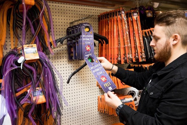
This Halloween, Poundland were giving away free invisibility cloaks. It’s a genius stunt that bagged them lots of exposure, for the cost of some hangers and a bit of packaging.
Must-read Articles ☕
Below are some articles that are absolutely worthy of a read during your coffee break:
- How to Write a Cracking Headline For Your Digital PR Campaign by Rebekah Massey 📣
- 3 Content Ideation Tips for Link Building by Lucy Stevens 🤔
- Creating Quality Content Comes down to One Thing: Relevance by Amanda Milligan 🤯
- We Asked Digital PR Pros About the Campaigns they LOVE to HATE by Rebecca Moss 😠
- Ask Me Anything About Building Links With Content by Gisele Navarro 💭
Must-follow Marketer 👑

Who: Danny Ashton, Founder of NeoMam
Why: Danny has been in the content production game for a long, long time. I attended his BrightonSEO workshop on creating infographics back in 2013, at a time where I thought infographics were trash, but he opened up my mind to them. I have him to thank for a number of years of infographic success, and NeoMam’s work is regularly featured in this newsletter.
To Conclude
As always, thanks to anyone who sent over content. I love seeing what people are working on, and hearing your challenges and successes!
If you’re not yet subscribed, feel free to do so in order to be notified of future issues, and follow me on Twitter where I often share awesome content examples.
Cheers,
Mark.