
Welcome to a slightly different version of Content, Curated. The eagle-eyed among you may notice that this issue, and the email that was sent out, are slightly different.
The newsletter has been moved away from the solution I was using, Revue, due to a few frustrations and limitations that unfortunately I couldn’t find a workaround for. As such all previous and future issues will be found right here.
Unlike previously, the issues will no longer be included in their entirety within the actual email, you’ll simply receive a quick note letting you know that the latest issue is live with a link to it.
To celebrate the (touch wood) relatively smooth transition of moving the newsletter to it’s new home, issue 7 is kicking things off with a fun collection of GIFs!
Made something you’re proud of? I’d love to see it! Send it over to markprtr@gmail.com 💌
GIFs Every Content Marketer Can Relate To 🙈
When a journo asks if they can have your piece as an exclusive, but you’ve already sent it to 300 people.

When you accidentally call a journalist the wrong name, then remember you set up a 2 minute delay on your sent emails.

When you’re pitching your shiny new interactive.

When a journo you pitched to steals your content idea and makes their own.

When your coverage gets syndicated across 150 sites and your colleague is salty.

When you’re checking a new piece of coverage and see there’s no link.

I’m a sucker for GIFs, so if you have any corkers please do send them over. Now on to the content…
Must-see Content 👀
Building Ages in the Netherlands 🏛️
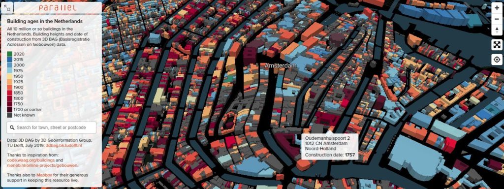
This is a really interesting Google Maps style view of Amsterdam, where buildings are coloured based on their construction date. It’s a great way of visualising an otherwise uninspiring data set. I did a bit of digging and similar maps can also be found for London, Brooklyn, Paris and Berlin, all equally fascinating.
Manhattan Revealed via 300,000 Taxi Rides 🚕

The above is created from a freely available data set of 300,000 taxi rides across Manhattan. Spotted originally on /r/dataisbeautiful, it’s another example of taking a data set that appears pretty mundane on the surface, and creating something amazing with it.
When Kids Design Their Dream Holidays 🧒
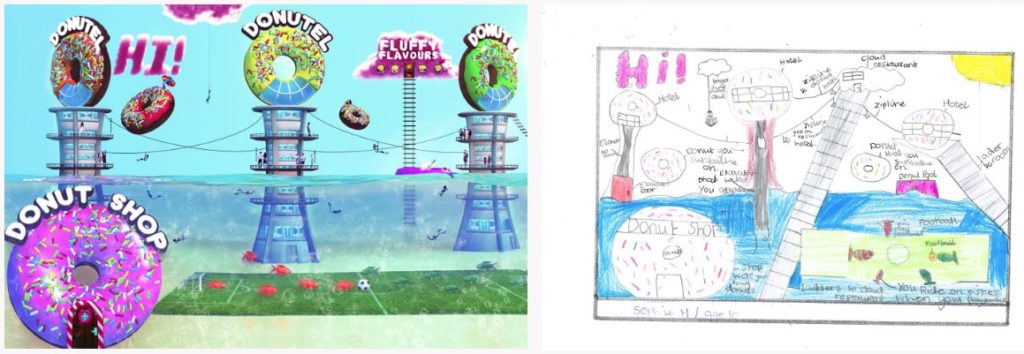
I’m a sucker for pieces like this. They’re fun, wholesome and a welcome distraction from the usual worrying headlines that dominate our news. I really like how the backstory accompanies each of the designs.
How the UK Transformed Its Electricity Supply 🏭
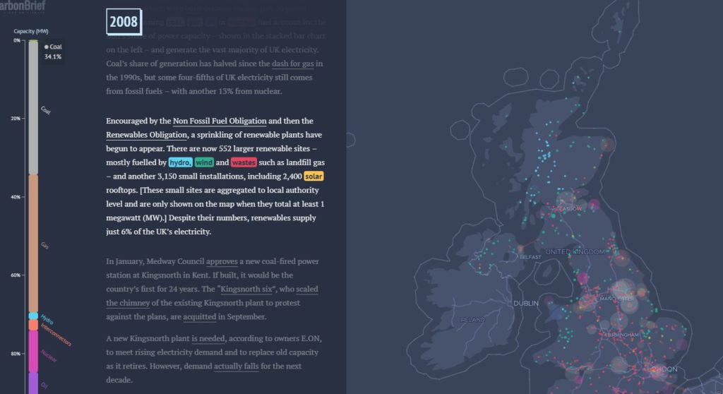
This interactive does an incredible job at displaying a tonne of information and data efficiently, with a strong narrative throughout. There are so many little touches that work well, with a thorough methodology towards the end.
Discovered via Jack Prouse 🕵️
What 100 Calories of Fruit Looks Like 🍓
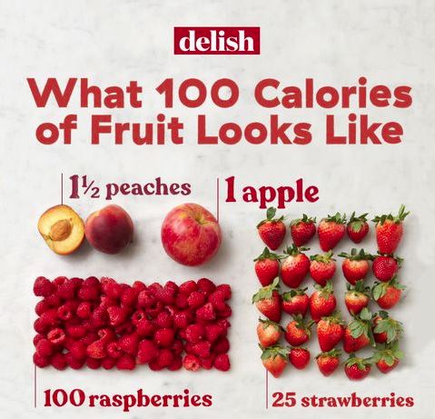
Simple, effective and likely didn’t take long to put together. It would be interesting to expand on this and include other common snacks, highlighting the extreme differences (considering a Mars bar has over 220 calories 🤤).
Taste the World 🍴
Did you know that there is a rare condition that means some people can ‘taste’ spoken and written words? I didn’t, which is why this piece blew my mind. It’s a really unique and creative idea, which sent me down a synesthesia rabbit hole.
Fake Followers 🤔
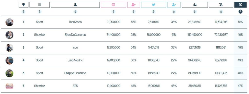
Analysing the followers of celebrities has been done before, but I’ve never seen both Instagram and Twitter followers combined and audited to work out who is spending the most on Fiverr. It’s presented in a really clean and easy to digest way, with sortable data and a transparent methodology. It also links to the raw data, which really adds credibility to a piece.
Slavery’s Explosive Growth
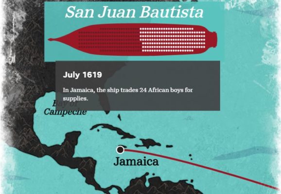
Note: You may need to use a proxy/VPN to view this piece, otherwise you’ll just be redirected to the homepage.
This is a really amazing piece that explores how slavery grew exponentially in the US, through the use of data, narrative and great visual design.
Discovered via Vince Nero 🕵️
Trails of Wind 🛫
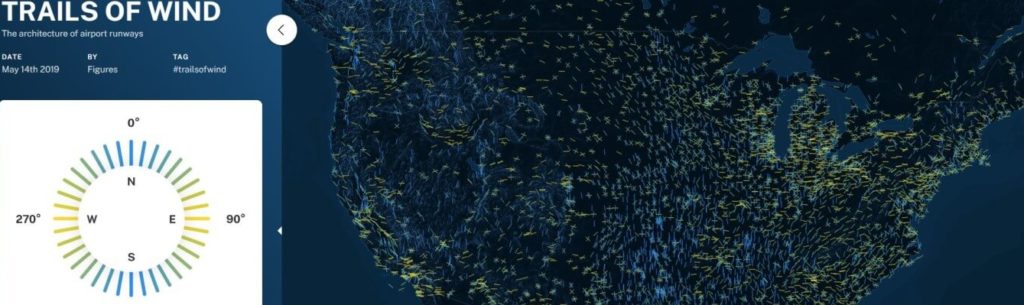
This is not something that’s ever crossed my mind before, but airport runways are specifically aligned to point towards the wind, with most in a North/South orientation. It makes perfect sense, as aircrafts can take off and land more easily. This piece visualises the orientation of thousands of runways, essentially highlighting the way winds circulate around our globe.
Discovered via Freddy Barnes 🕵️
Cities for the Best Work-Life Balance 🏙️
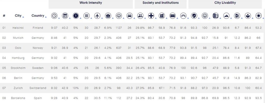
I’m a big fan of indexes and they can work incredibly well. It’s essentially taking data that’s already out there, and blending it. The hard part is finding said data and ensuring it’s from a reputable source, and then crunching the numbers to work out the key angles. This one is probably one of the most comprehensive indexes I’ve seen, with solid sources and a credible methodology.
Discovered via Jack Prouse 🕵️
More Great Content…
- STI Partner Notification 🍆 discovered via Rebecca Moss 🕵️
- How Much Warmer Is Your City? 🌞
- The Average Price of a Date in the US 🌹 discovered via Pat Langridge🕵️
- International Book Lovers Index 📚 discovered via Catriona McGale 🕵️
- Mass Shootings Since Sandy Hook 😔
- Game of Thrones Ratings 📉
- Dominant Colours of the World’s Countries 🌎 discovered via David White🕵️
- Ishkur’s Guide to Electronic Music 🎶
- Top 10 First Dance Songs 🕺 discovered via Pat Langridge🕵️
PR Stunts
The below campaigns may not have been intentional PR stunts, however they did attract substantial attention from the media.
Insta Boyfriend Photography Tour 📷
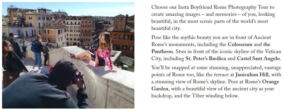
Heading to the amazing city of Rome? Don’t have a significant other to snap you posing in front of the Colosseum? Fear not, this tour will take you to the main sights of the city, snapping professional pics for the gram as you go.
Discovered via Catriona McGale🕵️
What The @*!$? 😠

Nurofen teamed up with a panel of experts to carry out a highly scientific experiment to find out if swearing helps you cope with pain. The end result is an amusing and enlightening video.
Discovered via David White 🕵️
Dirtiest P*rn Ever 🙈

To raise money for the environment and highlight the growing concern around plastic within our oceans, Pornhub created the Dirtiest Porn Ever (this link is safe for work). Set on a heavily littered beach, every watch results in a donation to Ocean Polymers, to help fund their efforts to clean up our mess.
Discovered via Carrie Rose🕵️
Must-read Articles ☕
Below are some articles that are absolutely worthy of a read during your coffee break:
- Email Outreach: The Ultimate Guide 📧
- Lessons Learned from Failing to Predict the Future by Hannah Smith 🤯
- How to Build a Content Marketing Outreach List by Domenica D’Ottavio 💌
- How to Visualise Data for a Successful Digital PR Campaign by Aliyah Loughlan 📊
- 4 Ways to Capitalize on the Cross-Funnel ROI of Digital PR by Laura Hampton 💸
- The Do’s and Don’ts of Chasing for a Link by me! 🏃♂️
- Eight Subreddits Every Marketer Should Follow by Ross Simmonds 👽
Must-follow Marketer 👑

Who: Hannah Smith, Director at Worderist
Why: Hannah has a wealth of knowledge when it comes to creative content strategy, and recently blew my mind with her honest and insightful post on predicting the success of content campaigns. It’s pretty much guaranteed that you’ve crossed paths with one of her content pieces before, and they’ve been featured in previous issues (such as the Daily Routines piece).
If you have the opportunity to see her speak I highly recommend attending, and at the very least you should drop her a follow if you haven’t already.
To Conclude
Thank you to everyone that sent over content pieces, feedback and thoughts over the last month or so. I’m always open to suggestions on how the newsletter can be improved or what parts of it you enjoy most.
If you’re not yet subscribed, feel free to do so in order to be notified of future issues, and follow me on Twitter where I often share awesome content examples.
Cheers,
Mark.