Despite what our clients may ask of us, it’s almost impossible to guarantee that a campaign is going to secure a certain amount of coverage or links. While there are of course things that you can do to tip the odds of success in your favour, ultimately, no one know’s exactly how well a piece is going to do.
(If you can guarantee this, drop me an email, because you should probably be doing this newsletter instead.)
There’s been many content campaigns over the years that I’ve been pretty confident about, and they’ve subsequently received 100 or 200+ pieces of coverage, but there’s also been many that I’ve been confident about, that have completely flopped.
Flops are unavoidable. As content marketers, we get paid to try and ensure that there are more successes, than flops.
However, occasionally a piece crosses my path that makes me question everything I know about what makes good content, and I decided to share the most recent example on Twitter…
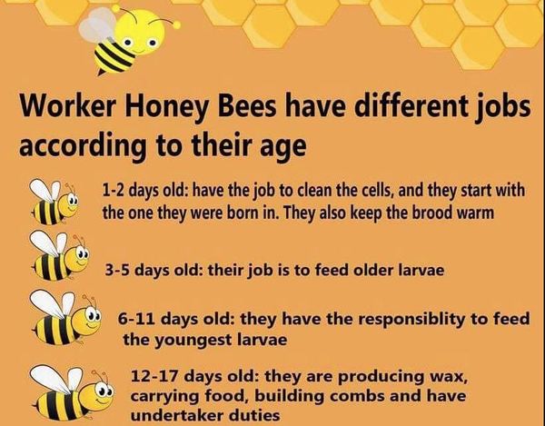
I asked people to take a look at this infographic on Honey Bees, and answer a poll with whether they think the piece is Terrible, “ok”, Good, or Great. I personally thought it was absolutely terrible, and looked like a poster you’d find on the wall of a Key Stage 2 classroom that was made in Microsoft Word.
The majority appears to have shared the same sentiment as me; over 55% of the 30 odd votes received thought it was ‘Terrible’, 29% thought it was “ok”, and 16% thought it was ‘Great’. No one went for ‘Good’.
However, people outside of the realm of content marketing apparently loved it, because it received over 65,000 upvotes and 1,210 comments on Reddit.
Why did this do so well on Reddit? Diving into the comments sheds some light on this:
- “I didn’t know that they lived such short lives. What does the hive do with the dead?”
- “…this is extremely accurate on how jobs in hive are split up, the age of the bee is one of the largest factors that contribute to what they do as a job.”
- “Damn, they don’t get a single day off? That’s a tough work schedule. 40-45 days straight without a personal day.”
- “Interesting” (yes, that is the entire comment, and it got 1,300 upvotes)
- “Aww it makes me sad now that every time I see a bee in a plant I know that it’s nearly dead.”
There were also many Bee Movie comments.
The design of the piece is complete trash (to put it bluntly), but the content clearly resonates with people. If you can look past the aesthetics and read it, it’s actually super interesting.
The information is essentially ‘mind-blowing enough’ to carry the piece to success. While success on Reddit isn’t exactly what we’re always aiming for (LINKZ), I’d be pretty happy if a piece of ours got over 65,000 upvotes.
It may seem obvious, but this is a good reminder of just how important the data/information/story behind a content piece is.You should never be in a situation where you are reliant on the design of a piece in order for it to do well, because the information isn’t up to scratch (There are exceptions of course, for example if it’s a design focused idea.)
That concludes this unusually long newsletter intro, now for the reason you’re really here: the content examples.
Made something you’re proud of? I’d love to see it! Send it over to markprtr@gmail.com 💌
Must-see Content 👀
That’s How It Ends? 📺
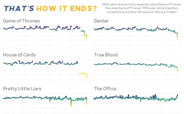
GoT is a touchy subject at the moment, and this may be too soon, but these minimal graphs by Bo McCready brilliantly display how some of the biggest series have fared on IMDb over time.
Discovered via /r/dataisbeautiful🕵️
Does the News Reflect What We Die From? ⚰️
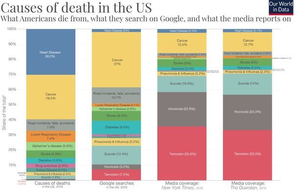
This piece by Our World in Data looks at causes of death in the US. More specifically, what they actually our versus what people Google, and what the media reports. The resulting disparity is pretty surmising in areas, but less so in others.
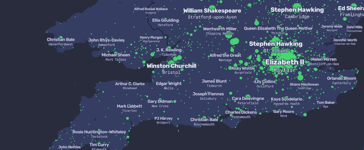
A People Map of the UK 🌍
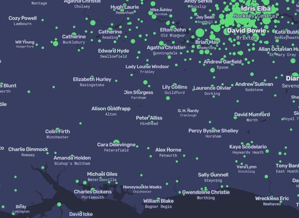
Once again, The Pudding make the newsletter (and probably always will). This piece looks at the most Wikipedia’ed famous person of each place in the UK (who have ties to that place, born, lived in etc.). There’s also a US version.
Discovered via The Pudding Twitter🕵️
The Toilet Study 🚽
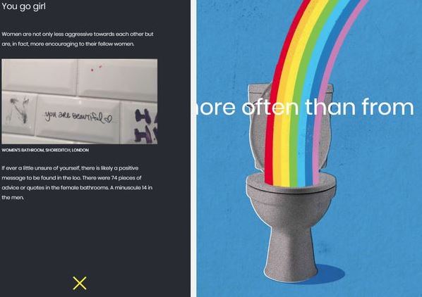
Potentially NSFW content. The Toilet Study analyses the scribbles found in public toilets, making comparisons between male and female. The findings are interesting, with real examples to back them up.
Discovered via Imperica Newsletter🕵️
Who Will Win Eurovision 2019? 🎤
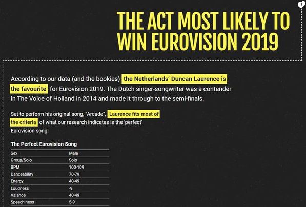
If you managed to endure another painful year of Eurovision, then you’ll know that Netherlands’ Duncan Laurence came out on top. Interestingly, this piece that blended multiple data points also had him down to take the crown. Should have put a bet in.
Discovered via Laura Crimmons🕵️
More Great Content…
- 30 Years of the Music Industry, Visualised. 🎶
- Cutaway London: A Look Inside the Most Famous Landmarks✂️
- The World Map of Currencies 💸
- The New York That Could Have Been 🗽
- The most Instgrammable destinations in the world for 2019🌞
- Most Endangered Species 🐅
- The Irregular Outfields of Baseball ⚾
- An illustrated guide to all 6,887 deaths in ‘Game of Thrones’🐉
- Sing My Name 🎤
- Airline Logos ✈️
- A Tribute to Video Game Architecture 🎮
- Iconic Album Covers Re-imagined with Birds 🐦
PR Stunts
The below campaigns may not have been intentional PR stunts, however they did attract substantial attention from the media.
IKEA Recreates Iconic TV Living Rooms 🛋️
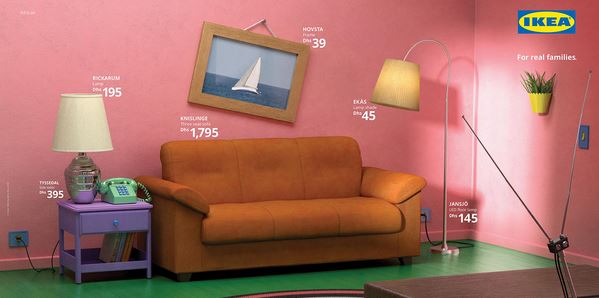
This genius campaign by IKEA involved creating iconic TV living rooms, using nothing but IKEA furnishings, and features Friends, The Simpsons and Stranger Things.
Condom Company Releases “Baby Blocker” 👶
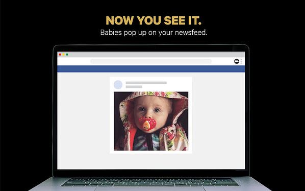
Condom company Skyn timed the release of their ‘baby blocker’ chrome extension with the birth of the royal baby. It identifies pictures of babies on social media, and subsequently swaps the image out for something else.
Miniature McDonald’s Beehive 🐝
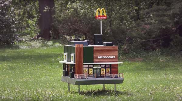
The ‘McHive’ by McDonald’s is essentially a tiny branch, for a tiny set of customers: bees. McDonald’s created this adorable structure for a charity fundraiser.
Must-read Articles ☕
Below are some articles that are absolutely worthy of a read during your coffee break:
- 4 Key Lessons Content Marketers Can Take From Data Journalists 📊
- Top Content Marketing Insights From Industry Experts 🔬
- What PROs talk about when they’re pitching a story – and it’s not always the story! 🗣️
Must-follow Marketer 👑

Who: Mark Rofe, SEO Consultant
Why: There’s a high chance you’ve already seen some of Mark’s work floating around the web already. His most recent example, Edit My Ex, was featured in an earlier issue and subsequently attracted global attention and a boat load of links. I’m hesitant to mention other examples of his work because I don’t want this to go into people’s spam folder, but take a look at his Twitter and you’ll soon find them (it rhymes with Bank Rock).
Mark is a highly creative guy who doesn’t take the industry too seriously, and I expect we’ll see another example of his work doing the rounds in the near future.
To Conclude
Thanks to everyone who sent over ideas, it makes putting together this newsletter much easier. If I did forget to give you credit, please feel free to call me out on Twitter.
If you’re not yet subscribed, you should probably go ahead and do so, and I’d love to hear any thoughts you have in general: mark.porter@screamingfrog.co.uk.
Cheers,
Mark.