2021 is in full swing, and while it still has the potential to make 2020 look like a good year, it does seem that this year will see some normality resume 🤞
It certainly seems like the world of content and PR is ramping up. People are realising now more than ever the importance of a good website, and are keen to ensure their brand is visible during these testing times.
Further to this, one of John Mueller’s recent tweets got PR’s and content bods all hot and bothered over the weekend when he highlighted how important Digital PR is.
All in all it’s a good start to the week, and there’s some awesome campaigns to share too.
Made something you’re proud of? I’d love to see it! Send it over to markprtr[@]gmail.com 💌
Must-see Content 👀
What Would the UK Flag Look Like if It Represented Its Constituent Nations Proportionally? ⛳

While not the most visually stimulating piece, I thought this was a really interesting idea. Reddit user Aeromidd reimagined the UK flag taking into account its constituent nations proportionally, looking at both population and land area. This idea could be easily spun out into a campaign looking at things like this across the world (though someone has also done similar for the US flag).
Pasta Cooking Spotify Playlists 🍝
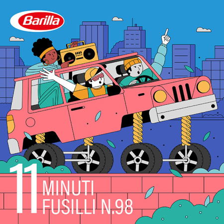
Italian multinational food company, Barilla, have put together a series of Spotify playlists that last the correct amount of time for cooking different types of pasta. It’s a niche idea, but it’s relevant and fun.
Discovered via Katheryn Watson 🕵️
2020 Game 🦠
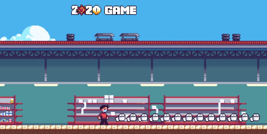
As if living through it wasn’t enough, you can also play this cute pixel game that contains all the major events of 2020. The toilet roll smash and grab was a personal highlight.
Discovered via Rory Marsh 🕵️
Which Cities Are Best to Survive a Zombie Apocalypse? 🧟

This is an interesting idea that uses data points such as solar energy produced per year, farming area, air quality, outdoor space, wind farms and more to identify the UK’s best self-sustaining cities.
Popular Netflix Shows Reimagined as Vintage Books 📚
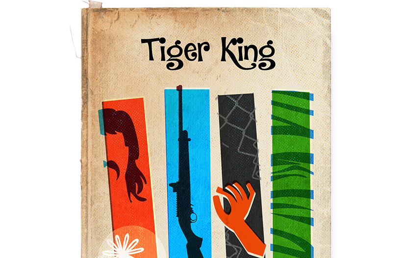
Once again another ‘reimagined’ idea, this time turning popular Netflix shows into vintage book covers. It’s very well done, and I’m sure it was good fun to make.
Discovered via Amy Hunt 🕵️
How Bad is your Spotify? 🎼
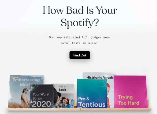
Ever wanted a sassy and incredibly judgmental A.I. to go through your Spotify playlists? Thanks to The Pudding, it’s now possible.
Polly Pocket Concepts Inspired by Disney Villains 🦹
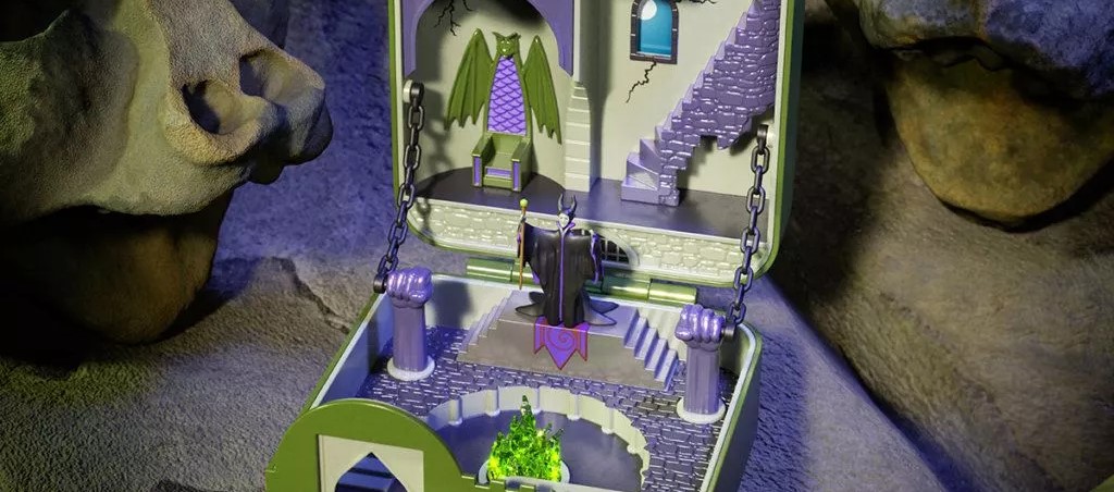
I loved the first instalment of these, and this one certainly doesn’t disappoint. As I mentioned first time around, it’s a really unique and well executed idea that maintains tight relevancy to the website itself.
Pixel USA 🌎
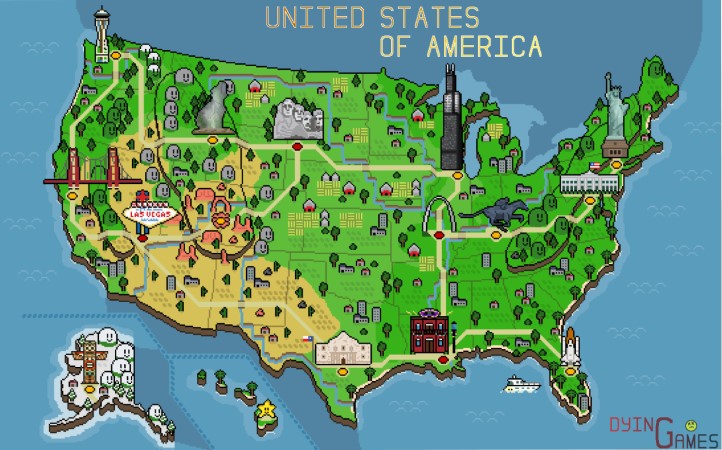
I’m a sucker for pixel art, so naturally including this example was a no-brainer. Redditor MrGreenValley put together this awesome retro pixel map of the USA, complete with recognisable monuments and locations.
Gender Diversity in the Computer Science Field 👩🏽💻
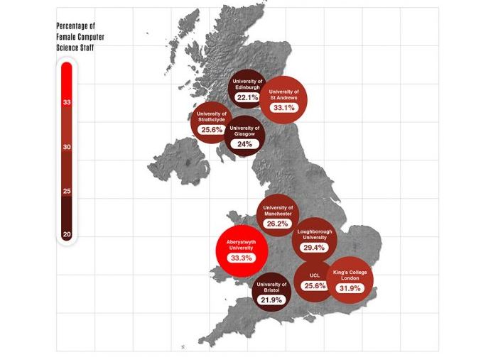
This data-driven piece looks at gender diversity amongst faculty staff at Universities in the UK and US. The thinking behind it is, if Universities have champion equality within their ranks then this can only help, and it’s clear there’s still a long way to go in some instances.
Discovered via Pat Langridge 🕵️
ContentAsKits ⚽
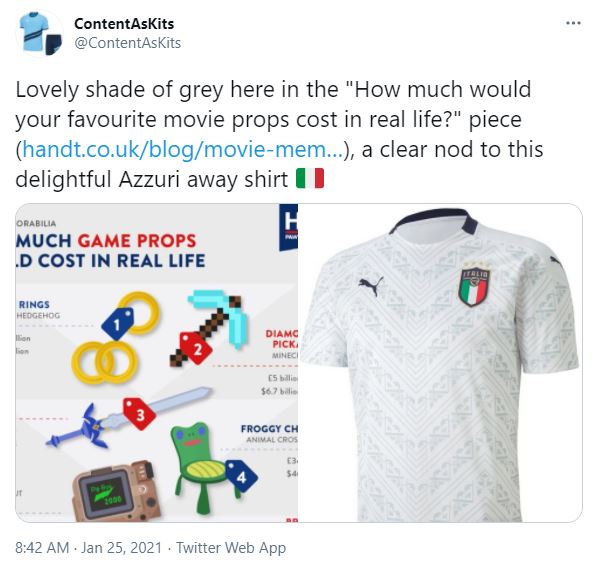
Have you ever looked at a content piece and thought, that really looks like Barnsley’s away kit? If for some reason you have, you’ll love this new content related Twitter account, ContentAsKits. It matches the aesthetic of a content piece to a football kit, because why not?
More Great Content…
- 5g Speeds: Here’s How Much Faster New Internet Speeds Will Be 📡
- Pharmacy Blackspots of the UK 🩺
- Data Shows Learners Lost £1,139,489 During Lockdown! 💸
- All Roads Lead to Rome 🚗
- Movie Memorabilia 🎥
- Where in the UK Has Seen the Best Stock Market Performance During COVID-19? 📈
PR Stunts
The below campaigns may not have been intentional PR stunts, however they did attract substantial attention from the media.
Heinz Ketchup Drawings 🍅
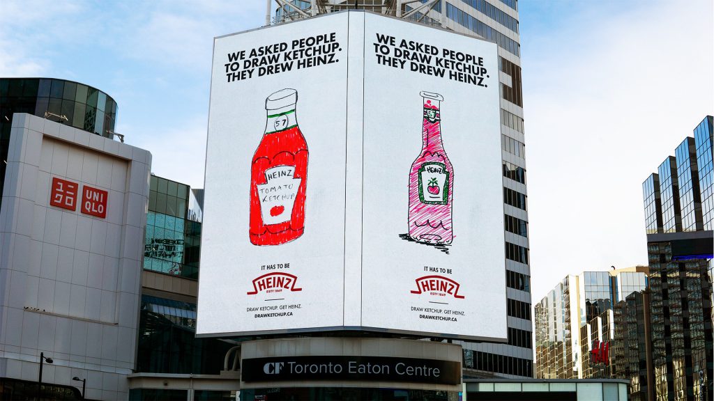
There’s something about these campaigns that always does well. Granted, a brand like Heinz is always going to gain some kind of traction, but asking people to draw things from memory or children to reimagine something always drums up interest. In this example, Heinz asked people to draw ketchup, and of course the majority of people drew the recognisable Heinz bottle.
Climate Crisis Font 🧊
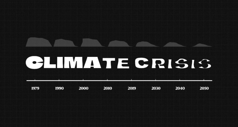
Helsingin Sanomat, a Nordic newspaper, created an evolving font that raises awareness around climate change. In their own words:
“The font’s weight responds to NSIDC’s (National Snow and Ice Data Center) Arctic sea ice data from 1979 to 2019 and IPCC’s prediction all the way to 2050, showing how the ice is expected to shrink because of climate change based on current forecasts.”
It’s a really unique idea with a well made landing page to boot.
Must-read Articles ☕
Below are some articles that are absolutely worthy of a read during your coffee break:
- NeoMam Jealousy List 2020: The 28 Best Campaigns We Didn’t Produce 🤯 by Gisele Navarro
- How to Stay Creative While Working from Home 👨💻 by Peter Bingham
- Benchmark Your Online Coverage Metrics 📊 by Gary Preston
- The 8 Digital PR Tools You Need in 2021 🧰 by Surena Chande
- The 40 Weirdest (And Best) Charts We Made In This Long, Strange Year 📈
Must-follow Marketer 👑

Who: Louise Parker, Digital PR Director at Propellernet
Why: If you’re not currently following Louise, you’re missing out on highly relatable Digital PR TikToks, notable campaigns and insightful knowledge. She currently heads up Digital PR at Propellernet who I’m pretty sure have featured several times in the newsletter.
To Conclude
That concludes issue 22 of Content, Curated. I hope it’s useful when it comes to fleshing our your content ideas for the beginning of this shiny new year, and as always please feel free to send over any campaigns for consideration (markprtr[@]gmail.com).
If you’re not yet subscribed, feel free to do so in order to be notified of future issues, and follow me on Twitter.
Cheers,
Mark.