March can be summed up with 3 simple words: bar chart races. They’re everywhere at the moment. I debated making a bar chart race to show the rising popularity of bar chart races, and as funny as that might’ve been, it looked far too complicated to make one.
Because they’re such hot property at the moment they have their own dedicated section in this issue, which might offer some inspiration if you’re thinking of putting one together. However, they seem to lend themselves well to social as opposed to attracting coverage and links, so do your research before churning out 15 of them (and ruining the format, because that’s what we do).
Bar charts aside, there are plenty of amazing content examples to get through in this issue, so without further ado…
Made something you’re proud of? I’d love to see it! Send it over to markprtr@gmail.com 💌
Must-see Content 👀
Who is the Biggest Pop Star? 🎵
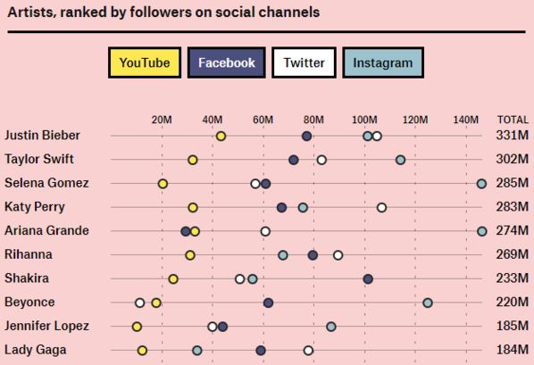
Another issue, another mention for The Pudding. They really are the gold standard when it comes to data driven pieces, and one of their most recent pieces looking at the biggest pop stars is no exception.
Discovered via Faisal Anderson🕵️
The 2080s “Past is the Future” 🕶️
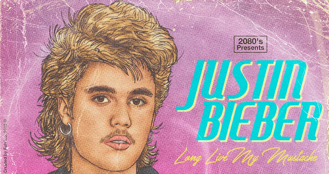
These 80s inspired LP covers for relevant artists are incredibly well done, with witty album titles to boot. The DJ Khaled one is personal favourite.
Discovered via Caroline Noades🕵️
Fruit of Your Loins 🍌
Immediate disclaimer: If you’re eating a banana or an orange at this very moment, skip the above for now. Trust me. While this piece makes me feel incredibly uneasy, I think it’s a really creative way of making a NSFW piece SFW, whilst still maintaining some educational value.
Discovered via David White🕵️
First year of life for six Swainson’s Hawks 🦅
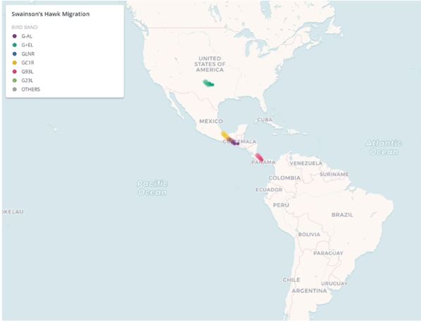
One for wildlife lover’s and a piece I found oddly fascinating, on the movements of six Swainson’s Hawks during their first year of life. Slightly depressing how many make it back, but it could have been a technical glitch, according to the author.
Discovered via /r/dataisbeautiful🕵️
Killed by Google ⚰️
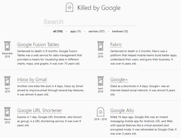
Killed by Google is a collection of 150 apps, services and hardware that Google have binned off over the years. You’ve probably not heard of a lot of them, but it’s an interesting reminder on how many avenues they’ve pursued.
More Great Content…
- A Visual Guide to the Creatures That Could Disappear From Each U.S. State 🦋
- Nike’s latest financial quarter, visualised 👟
- Ante Up: The Distribution of Forbes Billionaires Across the Globe in the 21st Century 💸
- How many high school stars make it in the NBA? 🏀
- Price changes in textbooks versus recreational books over the past 15 years 📚
- The 50 Best Places in America for Starting a Business 🌆
- Disneyfication Map – Mapping Overtourism Risk 🐭
- 6 Aerial Views of the World’s Oldest Metro Systems 🚂
- In Her Kitchen 👩🍳
- Ranking the World’s Best Tourist Attractions 🎢
- Global cities house-price Index 🏘️
- Forgotten Ireland: Historical photographs taken at turn of 20th Century are brought to life ⌛
Bar Chart Races
Top 15 Best Global Brands Ranking 🌍
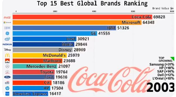
It seemed apt to start with the one that kicked it all off. This graph by Interbrand, highlighted by Matt Navarra, undoubtedly filled people’s heads with hundreds of ideas for bar chart races before the animation was even finished.
Shifts in How Couples Meet
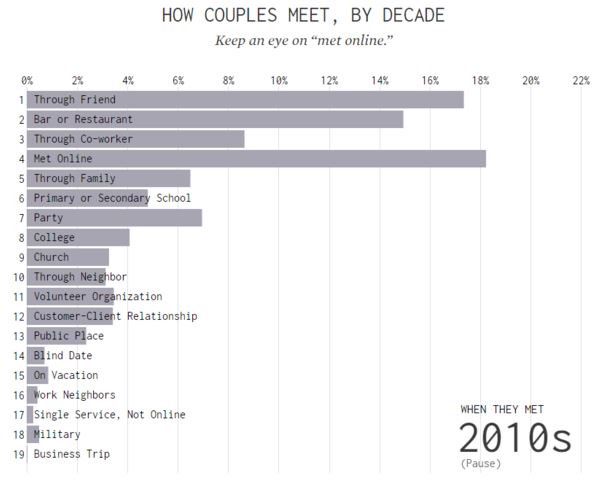
This one by FlowingData is probably my favourite example. It looks at the various ways couples have met over the decades, and while the inevitable surge of ‘Met Online’ isn’t at all surprising, it’s interesting to watch the other means of meeting tail off.
Discovered via Faisal Anderson🕵️
Top 15 Steam Games by Player Count 🕹️
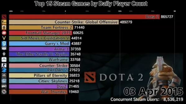
We all know how popular PUBG was in it’s prime, but this bar chart race effectively highlights the staggering popularity of it in comparison to several other high populous games on Steam.
The Most Populous Cities in the World 🌍
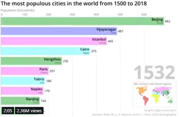
If you don’t already follow John Burn-Murdoch then I highly recommend you do so, so you don’t miss out on his latest datavis pieces, such as this bar chart race looking at the most populous cities in the world since 1500 (!).
More Bar Chart Races…
- Market Capitalization of Tech Companies over the Last 23 Years 💵
- Top 20 Most Popular Male Names (1880-2017) 👶
- GoT: Which Character Has Received the Most Screen Time?👑 (h/t Carrie)
- Top 10 Richest People In The World (1995-2019) 💰
- Top 10 Countries by Inflation Rate (1980-2018) 📈
PR Stunts
The below campaigns may not have been intentional PR stunts, however they did attract substantial attention from the media.
Get Free Domino’s 🍕
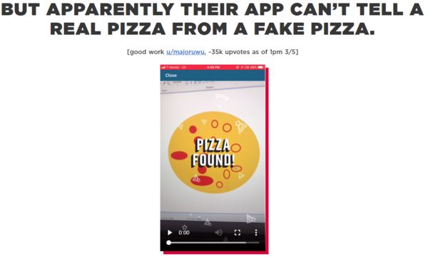
Domino’s were offering free pizza if you downloaded their app and took a picture of a pizza, however their groundbreaking pizza detecting technology was easily fooled. A competing pizza chain &pizza, put together this microsite complete with a crude MS Paint drawing of a pizza that fooled the system and bagged you a freebie (or 100 freebies). Genius.
Aldi’s Teatime Takedown (Epic Fail) 🚮
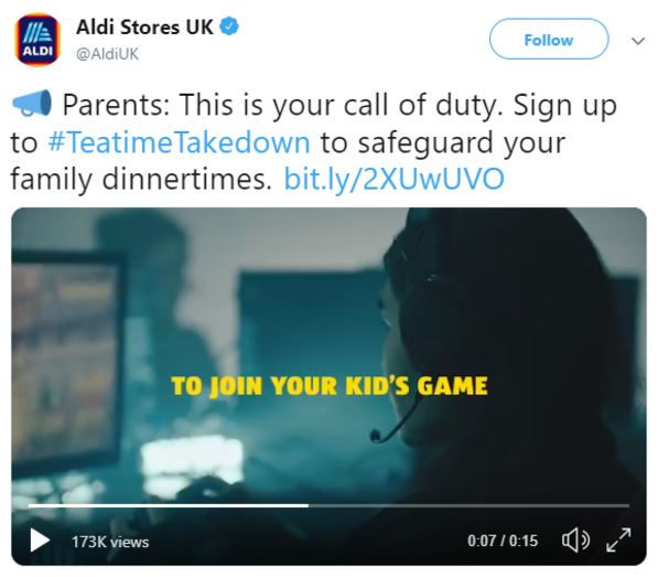
This stunt by Aldi reeked of poor planning right from the outset. As part of the #TeatimeTakedown campaign, Aldi were allowing parents to submit their children’s gamertags, to allow an e-sports pro to join their game and ‘take them down’, thus ‘restoring family dinnertime’. Logistically it made zero sense, and you wonder if the people behind it had any concept of how online games worked whatsoever.
Barbie Reimagined on Her 60th Birthday to Show Her Real Age 👵
What would Barbie look like at aged 60? Lumen, a dating site for over 50s, decided to find out.
Must-Read Articles ☕
Below are several articles that are absolutely worthy of a read during your coffee break:
- How to make “bar chart race” visualisations without coding📊 by Katherine Riley
- Using Data GIF Maker to compare data and tell stories 👍
- Nofollow vs Follow Links: Everything You Need to Know 🔗 by Joshua Hardwick
- 25 Awesome Content Marketing Tools 🛠️ by Brian Dean
- How to Make Dope Shit: Part 2 💩 by Ilia Blinderman
- Our World in Data 📡 (Huge data source)
- Top 100 Research Articles 👀 h/t Jon Cooper
- Five Proven Content Formats to Maximise Link Acquisition with Digital PR 🧠 by James Brockbank
Must-follow Marketer 👑
Who:James Brockbank, MD of Digitaloft.
Why: I really enjoyed James’ most recently article on proven content formats, mainly because I’m a sucker for content examples with big link numbers (as you may have guessed), and his recent podcast with Jason Barnard is absolutely worth a listen. Plus, we have a shared pain in the fact we have to endure our kids watching multimillionaire YouTubers.
To Conclude
That concludes the second issue of Content, Curated. Thanks to everyone that sent me over great examples, if I forgot to give you a nod I apologise! If you’re not yet subscribed, you should probably go ahead and do so, and I’d love to hear any thoughts you have in general on Twitter, or via email: mark.porter@screamingfrog.co.uk.
Cheers,
Mark.
